Farrison Hord
Years ago

All-Time Greatest NBL Uniforms/Jerseys

Out of sheer curiosity:

What would everyone list as their favorite uniform/jersey design of all time across all teams?

I was going to say your top 3 but up to you!

Topic #39963 | Report this topic


Anonymous  
Years ago

Hawks early 1990s as worn by the likes of Melvin Thomas, Norman Taylor, Doug Overton. They seemed to have the same uniform for years, kind of like how NBA teams do to build brand awareness and team identity.

North Melbourne Giants 94 teal. Also kept it for several seasons.

Kings black with yellow pinstripes was also quite a statement at the time.

Would be great to see teams stick with a look for more than one year.

Reply #599495 | Report this post


NBL Fan  
Years ago

Off topic but anyone else think that the Mitchell & Ness jersey designs aren't as good as what we saw with ISC?

Reply #599497 | Report this post


alexkrad  
Years ago

1995/6 Coke Wildcats

Reply #599499 | Report this post


ME (he/kangaroo)  
Years ago

"Off topic but anyone else think that the Mitchell & Ness jersey designs aren't as good as what we saw with ISC?"

Completely disagree. ISC were terrible with their pastel colors and lazy designs. The new uniforms are probably the best I can remember from the past decade.

Reply #599500 | Report this post


koberulz  
Years ago

Seriously?

First of all, the uniform partner only makes the uniforms, they don't design them, so there's no reason it'd make any difference whatsoever.

Secondly, Adelaide are using the same ugly design as last year and Sydney and Perth have hit all-time lows.

Reply #599501 | Report this post


KET  
Years ago

Victoria Titans, Early 000's Wildcats, Early 000's/late90's 36ers

Reply #599506 | Report this post


Isaac  
Years ago

A lot of uniform design gets corrupted by sponsor/marketing requirements. In the NBA, clubs would be strong enough to dictate terms, but less so in the NBL.

Thus the mess you see. M&N logo is too big, for one example. Sponsors insisting on white backs behind logos rather than using white versions of their logo on the brand colour, as another example.

The 36ers ones start with a mess and *then* add sponsor logos! I really dislike the grey effect they use, whether camo or street map or whatever the latest is.

Reply #599514 | Report this post


koberulz  
Years ago

A lot of uniform design gets corrupted by sponsor/marketing requirements.
That doesn't explain Adelaide's camo, Perth's red on red with red trim and no sign of the club logo, or Sydney's...whatever that mess is.

Sponsors instead of white blacks behind logos rather than using white versions of their logo on the brand colour
The ones that really annoy me are Cairns and New Zealand, who could just swap the logos between their home and away uniforms and be perfectly fine.

In the NBA, clubs would be strong enough to dictate terms, but less so in the NBL.
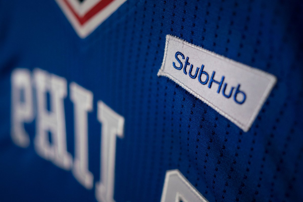
I don't think they do dictate terms. Sponsors are irrelevant, since they're not even allowed by the league, but in terms of the rest of the design I believe it's a collaboration between the jersey manufacturer and the club. I remember a story about them having to point out to GSW that they'd left no room for numbers in their initial design of their current jersey.

Something similar needs to happen here, because some of the designs we're seeing are just awful, regardless of sponsor logos.

Reply #599518 | Report this post


KET  
Years ago

The NBA now has advertising on singlets albeit with strict limitations of placement


Reply #599519 | Report this post


KET  
Years ago

Fastforward to 2030

Reply #599520 | Report this post


FM  
Years ago

Teams are still in their pre-season gear. New uniforms for first round is normally the case year by year. The Sixers uniform they are wearing for games at the moment is from the TopEnd games

Reply #599521 | Report this post


koberulz  
Years ago

Teams generally have their gear for the Blitz/ABC, not round one, and with the ABC being tomorrow teams have been announcing their designs for the past couple of weeks.

Reply #599522 | Report this post


KET  
Years ago

https://twitter.com/NBL/status/778797270489706496

Reply #599523 | Report this post


KET  
Years ago

So....no naming rights sponsor again for Adelaide?

Reply #599524 | Report this post


Ricky  
Years ago

So clean, so nice..

Reply #599525 | Report this post


koberulz  
Years ago


So...Melbourne and Cairns look decent, I guess?

Reply #599527 | Report this post


koberulz  
Years ago

The ATA logo is literally the only thing you can see on the Wildcats jersey...

Reply #599528 | Report this post


Zodiac  
Years ago

The Cairns and maybe Brisbane ones are the only decent ones.

Hawks, Melbourne and Perth look real bad but the Kings should be kicked out of the league for their effort. I would be embarrassed to wear that Kings jersey.

Overall I always thought the Crocs had the best looking uniforms for mine but I was quite partial to the lavish mid-90's Wildcats uniform.

Reply #599529 | Report this post


Bear  
Years ago

@KET, gosh that would be disastrous wouldn't it, can't see the NBA going that way but the way the NBL is going it worries me?

@Ricky, now you're talking, those uniforms were excellent.

The current designs are average at best, but if I had to grade them I would give a pass to United, Taipans and Bullets. Maybe a small improvement to the 36'ers and they would also get a pass, but the others need to go back to the drawing board immediately!

Reply #599531 | Report this post


Isaac  
Years ago

Brisbane and Cairns are decent this season. Not so keen on the rest.

Reply #599533 | Report this post


KET  
Years ago

Haha it'll be like Nascar

Reply #599535 | Report this post


Anonymous  
Years ago

The 94 Nth Melbourne Giants changed the uniform game, !st team with the long shorts.

Best ever

Reply #599536 | Report this post


koberulz  
Years ago

Good
Cairns

Okay
Melbourne
Illawarra
New Zealand

Meh
Brisbane

Bad
Adelaide

Awful
Sydney

PLEASE MAKE IT STOP
Perth

Reply #599537 | Report this post


KBRulzRulz  
Years ago

Maybe fans should start writing to sponsors and telling that they thank them for supporting their sport team, but they hate their brand because it ruins the look of the sport team. Could that work?

Reply #599539 | Report this post


Anonymous  
Years ago

Doubt it. Wouldn't be enough people who care.

And the sponsor logos aren't actually that big a problem. Sydney's abomination of a jersey doesn't even have any. Neither does Adelaide's. And honestly, I think the Perth one would look worse without the sponsor logos on it. At least they break up all that red.

Reply #599540 | Report this post


koberulz  
Years ago

Above post was me.

Reply #599541 | Report this post


Kingpodge  
Years ago

companies don't make money from thank you letters, companies make money from brand association and brand recognition.

You don't want a uniform looking like pre-pubescent teenage girls pencil case (do kids have pencil cases anymore?), but teams do need the $$ that comes with large visible branding.

There's a middle ground.

Reply #599542 | Report this post


twenty four  
Years ago

From left to right in that photo:

Acceptable; lolwut?; TURRIBLE, JUST TURRIBLE; fine, but name needed to be a bit lower; poor man's Washington Wizards. Like, really poor man's; well it doesn't suck, so there's that I guess?; could do without the stripes on the shoulders, but okay; this one, too, is acceptable.

Overall: underwhelming.

Reply #599543 | Report this post


TimberBall  
Years ago

Wildcats is awful but has one saving grace which is the city scape on the back and the watermark logo on the shorts. Kings looks like a training uniform.

Best ever is the Coke Wildcats, little wonder they sold out in 30min in heritage round at $200

Reply #599544 | Report this post


Isaac  
Years ago

teams do need the $$ that comes with large visible branding.
At this level, how many decisions relating to branding as it appears on a uniform are being made by people without an eye for what presents them best?

The chest sponsor on the Hawks uniform is a good example. Skycity branding is similar.

Then again, the same often happens with major soccer teams.

Reply #599547 | Report this post


bear  
Years ago

South Dragons playing strip was one I really liked, simple and effective, very cool looking!

Reply #599550 | Report this post


KET  
Years ago

Agree with Isaac, just slapping on a sponsors logo as a bumper sticker on a singlet produces a lack of polished design and finesse which makes the singlet and the sponsor logo look pretty bad.

I also agree with bear, the South Dragons tops were probably the best in the last decade and a half to be honest.

Part of the shame is the generally ugly or unusually long sponsor logos.

Cairn's CQU logo is unusually long, albeit they have adapted it relatively ok.

Perth's alcoholthinkagain is too long albeit I don't mind how they adapted it, ECU is a messy square of a logo which they can't do much about, the HIF logo with the massive white blob looks silly they need to either have a white outline or a smaller white box.

Melbourne's AHG i've never been a fan of the logo.

Wollongong's Southern Cross logo is both ridiculously long and visually average. I don't think they can cure either issue.

Adelaide and Brisbane need major sponsors.

NZ's Skycity logo adaption isn't bad but the skycity logo is pretty sleak and could be better adapted.

Reply #599556 | Report this post


Bear  
Years ago

Here are some ideas I have, just off the cuff that IMO would make the uniforms better, just by adopting them as a standard.

1. Small company/sponsor logo on front
2. Larger logo on the back, one major sponsor only
3. Single main colour uniform body with two clash options
4. Numbers and trim in opposite colour (not the same colour as the main body)
5. Pin stripe designs and silhouettes to enhance the quality of the overall look, not detract from it
6. Player names on back and club name on front
7. Shorts to follow these rules, using major colour and opposing trim to highlight the design and only small logos to be used
8. Keep it simple, traditional and like basketball singlets should be while still maintaining the true identity of the club, stop getting carried away with too much and get rid of the ugliness (less is more)...

Reply #599558 | Report this post


Bear  
Years ago

...and get rid of the ugliness...

Yes, this is just a rant, don't treat all of the points as literal.

However, literally, the designers may have no comprehension that no one can see or read these sponsor logos from the stands anyway.

No one is close enough, the players move too fast and the only time sponsors will benefit is during close ups, interviews and if punters buy their singlets.

So, the strategic placement and thought put into these designs will be crucial to their success, it appears however that there has been very little thought or common sense applied here!

Reply #599559 | Report this post


Ralph Lauren  
Years ago

Bear as has been said ad nauseam, having less sponsor logos or smaller sponsor logos is not an option for NBL teams.

It's got nothing to do with designers not realising logos can't be seen from the stands. It's about keeping the people pumping hundreds of thousands of dollars into a team happy. Without them, there's no team.

With NBL still in it's infancy following last years re-birth, many of the major sponsors are not from large multi-nationals and they either don’t have brand guidelines or don’t understand them.

If you think designers like the bumper sticker look, you are delusional.

As for your pinstripe comment, that’s not going to make a uniform covered with sponsor logos any cleaner.

For years, the NBL mandated the exactly area and position for each element on the jersey. Looking at this years crop, that must've been lifted as Perth have moved player name below the number which i quite like, its a pity the colour contrast is non-existent though.

Reply #599565 | Report this post


Ricky Diculous  
Years ago

North Melbourne from '94
The yellow 36'ers pin stripe early 2000's
The simplicity of the Magic
The Crocs last season was quite good

Interesting that the Bullets have gone for the white home strip this season.
That's a rarity in the NBL. (I do recall the Supercats doing this in '91)

Reply #599571 | Report this post


Bear  
Years ago

I was so hoping not to have to quantify or qualify my ideas, that's all they were but since you appear to be upset at any criticism of designers (maybe you are one), then allow me to just clarify a few things there for you Ralph L.

By the way if the NBL has apparently lifted their mandate on restrictions for uniform designs as you have suggested it is certainly reflected in these new designs.

1. I am not actually saying we must reduce the amount of logos, if you read what I have posted it is more about where they are placed and how best to use them.

A larger logo on the back isn't as ugly as the one on the front covering too much space which may be better served to promote the league, the club and the town it represents.

It can still be done with the sponsor's best wishes and concerns catered for to provide them with the promotion of their business they deserve and pay for, however on the front this may be best suited to the interview stage where close ups easily identify the logo and the sponsor, but also makes the singlets more popular for people to purchase and wear perhaps...

2. The pinstripe is an option and if done properly with minimal effect could work, 'nuff said!

3. You have a good point in reference to designers and sponsors not being on the same page when it comes down to guidelines for placing logos on uniforms, so that's basically all I have posted, some ideas for a standard to consider when taking into account the fact that logos are pretty useless to promote to a live basketball crowd as you cannot see them anyway.

4. Finally, I ended my concept posts with the presumption that common sense would be applied to any design ideas or strategies, maybe you failed to comprehend that bit...

Reply #599581 | Report this post


Ralph Lauren  
Years ago

Yes, i'm a designer who has designed uniforms for several sports, and multiple uniform providers. When it comes to sponsor logos, what the sponsor wants wins out 9/10 times.

I've heard of a sport team sponsor pull out of large deal when the team mandated a mono version of the sponsor logo be used on a uniform to uphold their own brand integrity.

In some cases the uniform is designed the during the previous season with Logo-X in mind. Then at the last minute there’s a change of sponsor and that sponsor only has a white box logo.

There’s not much you can do when you’ve already been through rounds of approvals with team management, owners, the league office and manufacturer.


1 - Most sponsors want a big logo on the front. End of conversation.

2 - and i explained why in most cases it won’t work with the 6 elements as currently NBL uniforms have. Those being Left Chest, Mitchell and Ness, NBL, team logo/name, Sponsor, player number. There’s already enough going on without adding pinstripes.

Even the Mitchell and Ness logo is in a coloured block that contrasts the team colours. It’d look much cleaner if it was just a word mark.

3 - It’s not about the live crowd. It’s about being seen / known as the major partner which happens via closeups in the media, and the sponsor holding it in their hands.

4 - Strip away the excess logos from Cairns, Illawarra, and assuming they don’t have that god awful watermark on the back Adelaide for example and you have a clean strip.

AFL for the most part is minimal. Several NRL teams are covered in block logos front, back, sleeves and shorts. It’s a shame to see EPL teams are now also using block logos, but as mentioned before, money talks.

Reply #599607 | Report this post


koberulz  
Years ago

None of which has anything to do with the awful font on the Kings jerseys, or the giant blank space on theirs and Adelaide's, or Adelaide's street map or camo, or Perth's red text on a red background.

Reply #599608 | Report this post


XY  
Years ago

I didn't mind the Adelaide street map, particularly on the blackout uniform which I still think is one the best Sixers uniform of recent times. The camo pattern however is terrible and overwhelms the uniform.

Reply #599611 | Report this post


Ricky  
Years ago

Red text on Red shirt... i mean, what kind of proud designer would do that?

Can they come forward and give an explanation.

Reply #599616 | Report this post


Ralph Lauren  
Years ago

Red text on red like Perth's uniform is as much a fail as Hawks white on white last year. Completely unreadable from any sort of distance or TV.

Reply #599622 | Report this post


Isaac  
Years ago

Wollongong's Southern Cross logo is both ridiculously long and visually average. I don't think they can cure either issue.
I think they could've helped it but reducing the sponsor size only slightly, and dropping the colour band below it. Last year's uniform (I think it was) had two bands.

If you change colour and split that with a band, you cramp things up, doubling up on the padding between elements. Instantly looks busier.

Consider this throwback. Shrink the McDonalds logo and this is a decent, simple design:


The front, anyway. The back's TBH logo is obviously awkward, and the AHM logo is technically centred but not visually centred.

Another shot:

Reply #599627 | Report this post


Bear  
Years ago

@Ralph Lauren, I appreciate the frustrations you must have trying to produce under such contradicting and restricting terms, it is always tough to get the result you dream of when you have to comply within parameters that are not complimentary to your process.

Money talks and the sponsor needs to be seen, but the live audience doesn't matter and the end decision goes to the person with the biggest wallet!

That's kind of what I get from you, which is disappointingly frustrating to us fans as much as it must be to you guys.

Ah well, I was just expressing my opinion, which obviously has not enough $$$ behind it to be considered viable.

Never mind I guess, maybe I will just stick to buying those NBA singlets for my kids until someone in the NBL grows a pair, cheers...

Reply #599652 | Report this post


proud  
Years ago

The wildcats released a jersey to celebrate their 7th title and it had the Perth City skyline below "PERTH", very simple and effective and I liked it enough to buy it so I was shocked when I seen what the Wildcats will be wearing this season.

As for jerseys, I liked the Razorbacks when they entered the league, Tigers, Suns and Hawks jerseys during retro round really made me smile but the Coke Wildcats will always be my favourite.

I think The Hobart Tassie Devils had a green uniform that was dreadful, their black colours looked much better. Bring em back

Reply #599700 | Report this post


Anonymous  
Years ago

Sponsors come and go, not many stay for ever, but a fan is a fan for life.

Reply #599705 | Report this post


Anonymous  
Years ago

"Best ever is the Coke Wildcats, little wonder they sold out in 30min in heritage round at $200"

Wow really? I still have mint condition original Coke Wildcats jerseys from 1995 never worn. $_$

The Swan Gold early 90s were way better imo.

WTF @ Kings. How can you get rid of the opera house silhouette? Wow so bad.

Reply #600613 | Report this post


You need to be a registered user to post from this location. Register here.


Close ads
Little Streaks - The fun and interactive good-habits app designed especially for kids.
Serio: Tourism photography and videography

Advertise on Hoops to a very focused, local and sports-keen audience. Email for rates and options.

Recent Posts


.


An Australian basketball forum covering NBL, WNBL, ABL, Juniors plus NBA, WNBA, NZ, Europe, etc | Forum time is: 6:28 am, Mon 25 Nov 2024 | Posts: 968,026 | Last 7 days: 754