Anonymous
Years ago
2015/16 NBL Uniforms
Are teams getting new uniforms designs this year? Have any recent teams had the same uniform for more than one season?
Anonymous
Years ago
Are teams getting new uniforms designs this year? Have any recent teams had the same uniform for more than one season?
NBL Fan
Years ago
Hawks are reveling their new design this week. I would assume most teams would stick with their current designs as they are only 1 season old.
koberulz
Years ago
The Crocs have a new logo, so their jerseys will presumably be changing.
they would usually get new uniforms each season, sponsors change every year
If the lead by UTD is anything to go by, a simpler style may be the future? I like the uniforms to be more a simple NBA style with less pattern and less colour, basically less is more here.
RMQ
Years ago
Wildcats will be launching a new uniform at their Media Day closer to season opening - possibly their season launch breakfast.
Colours:
UTD - Navey/white trim - Reverse for away or clash
6'ers - Royay Blue/red trim - Reverse for away or clash
Wildcats - Red/black trim - Reverse for away or clash
Breakers - Black/Ocean blue trim - Reverse for away or clash
Hawks - Red/white trim - Reverse it too
Crocs - White/green trim - Reverse it
Tiapans - Orange/black trim - Away stirp could be white or black
Kings - Purple/Yellow trim - Same away strip of white or yellow
Keep it simple and when Brisbane come in they go Maroon/cream trim - Away can be cream or white with maroon trim.
alexkrad
Years ago
Wildcats will have new uniforms, not sure how different the design is but each player has different members names on them if you pre-ordered the jersey, like a few seasons ago when they had every wildcats player ever on the back I assume.
Hawks new uniform was sent to us members today.
They have gone back to black, like the championship team was.
Flinders80
Years ago
Has any team approached project 34 designs...... Always liked his designs as they were nice, clean and modern
Those new Cats jerseys are u-g-l-y!
I like the Hawks new jersey. Just a shame about the big white sponsors bumper sticker on the front of the home strip.
Just saw the Crocs one on Twitter, liking that one too.
Mark-e-Mark
Years ago
I think the ISC uniforms look absolutely terrible.
Loving the 17 sponsor logos on each Jersey. Especially the massive one across the wildcats chest where the team name should have been
RMQ
Years ago
Here's my take on how I think the jersey should look - excuse the crappy MS paint job. but u get the idea.
[img]http://i.imgur.com/BYQ7E1w.jpg?1[/img]
NBL Fan
Years ago
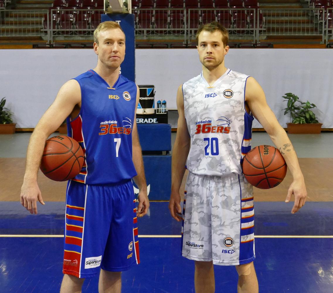
The new 6ers jerseys are very interesting. The away design is a camo jersey.
KET
Years ago

The camoflouge is just silly, they should have gone with this (minus the Westend sponsor obv)
http://www.nbl.com.au/wp-content/uploads/2015/09/creekav.jpg
Also, the 36ers logo really is bad, we should just go back to the 1998 logo and tweak it a little and adopt the "SIXERS" writing and "ADELAIDE" writing on our singlets like what they did with the singlet Creek is wearing
RMQ
Years ago
If the 36ers don't have a major sponsor, why don't they move their logo up to where it should be?
As i understand these jerseys are sublimated - so any new sponsor would require new jerseys to be manufactured?
swish
Years ago
Agree with KET re simply using "SIXERS" across the chest for home uniform ( maybe still have small 36ers logo somewhere) and "ADELAIDE" on away uniform.
Beantown
Years ago
I'm not a fan of the 36'ers logo either. Having a stylised ball is a bit naff IMO. The blue home uniform looks fine, but I don't think much of the camouflage effect on the away uniform. KET, I agree with you, I think the uniform Creek is wearing in the link above looks a lot better.
Beantown
Years ago
I suppose it could be worse though, they could have gone for sleeved uniforms!
Wookiee
Years ago
I think the Crocs and newly released Kings singlets are well ahead of the pack, the Hawks aren't bad, Perth and Adelaide's are yucko...
KET
Years ago
There's a map of Adelaide on the back of the 36ers singlet lol
https://scontent.fadl1-1.fna.fbcdn.net/hphotos-xta1/t31.0-8/12032638_10153590569113570_5559694462543408083_o.jpg
You need to be a registered user to post from this location. Register here.
Advertise on Hoops to a very focused, local and sports-keen audience. Email for rates and options.
An Australian basketball forum covering NBL, WNBL, ABL, Juniors plus NBA, WNBA, NZ, Europe, etc | Forum time is: 1:02 pm, Tue 4 Feb 2025 | Posts: 968,026 | Last 7 days: 754